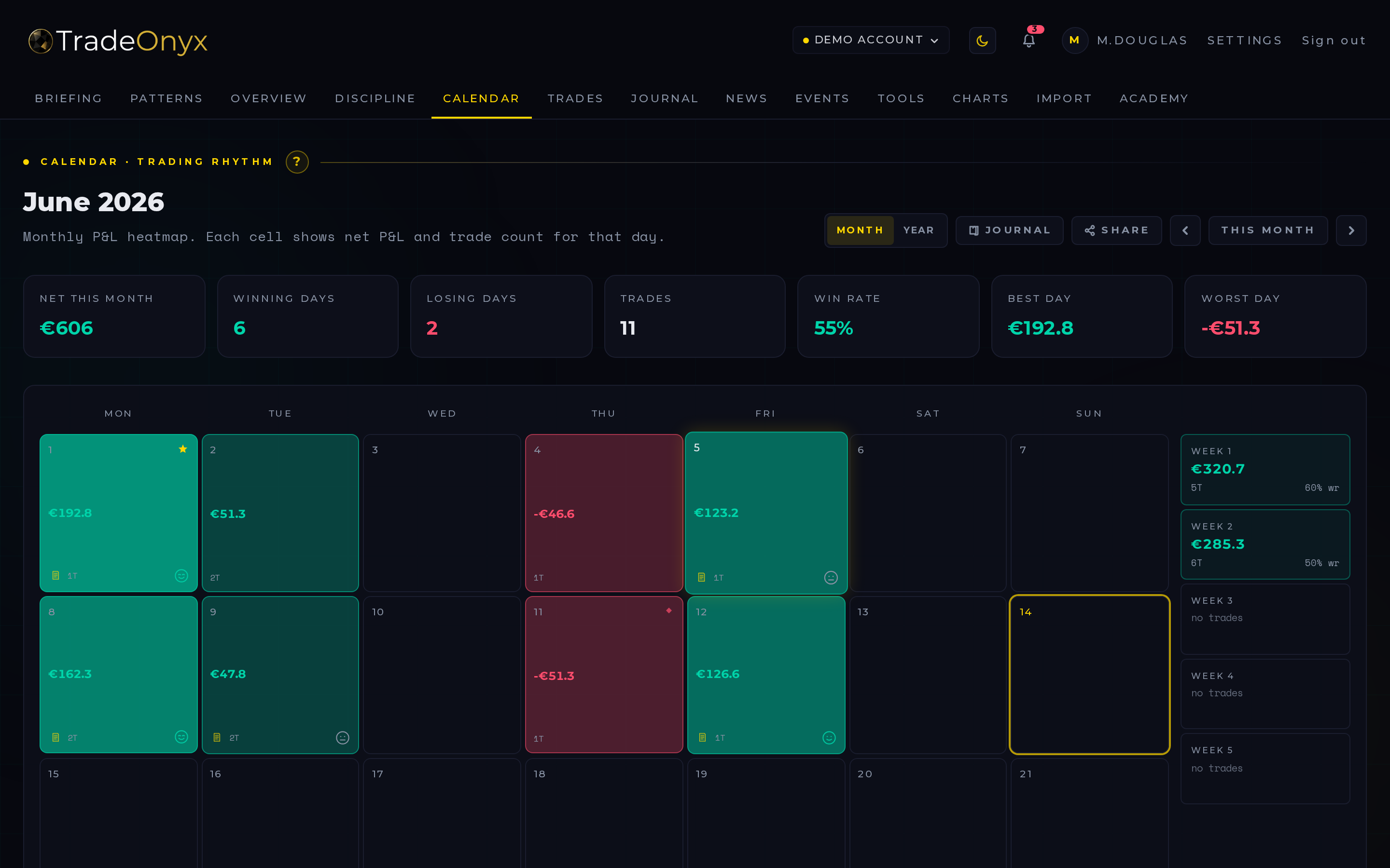
The Calendar tab is a daily P&L heatmap. Each tile is one trading day. Green means a winning day, red means a losing day, and the saturation of the color scales with the absolute size of that day's result — a tiny green is +€20, a deep green is your best day of the month.
Next to the grid sits a summary panel: best day, worst day, longest winning streak, longest losing streak, and the running total for the month. Days you've journalled show a small mood indicator on the tile itself.
Clicking a tile drills straight into the Journal entry for that day. The calendar is a navigation surface, not a static report.
- Color intensity tells the story — a row of pale greens and one deep red flags an outsized loser that ate a week of work.
- Streaks live in the side panel — five greens in a row is a momentum signal; five reds is a tilt signal.
- Empty tiles matter too — a Monday off in a green week says you respected your plan.
- Mood markers cross-reference psychology to outcome — confident days that turned red are the most useful learning material.
- Best/worst day links to the trade list — drill into the outlier, not the average.
- Month-over-month comparison — flip back a month and see whether your distribution is getting tighter.
Open Calendar in TradeOnyx as your weekly review surface. The grid shows immediately whether your week was carried by one outlier or built from consistent days — that distinction is everything when you talk to yourself about your edge.
Click the worst red tile and you land in the Journal entry for that day, with the Trades for that session attached. From there, drill into a single trade and pull it up in Charts to see exactly which candle you misread. The Calendar → Journal → Trades → Charts path is the core review loop TradeOnyx is built around.
For monthly closes, the side-panel summary becomes your scoreboard. Pair the longest losing streak with the Briefing entries from those days — TradeOnyx often surfaces that the streaks line up with skipped morning briefings or high-impact news days you traded through. The pattern is invisible in a P&L report; the calendar makes it impossible to miss.