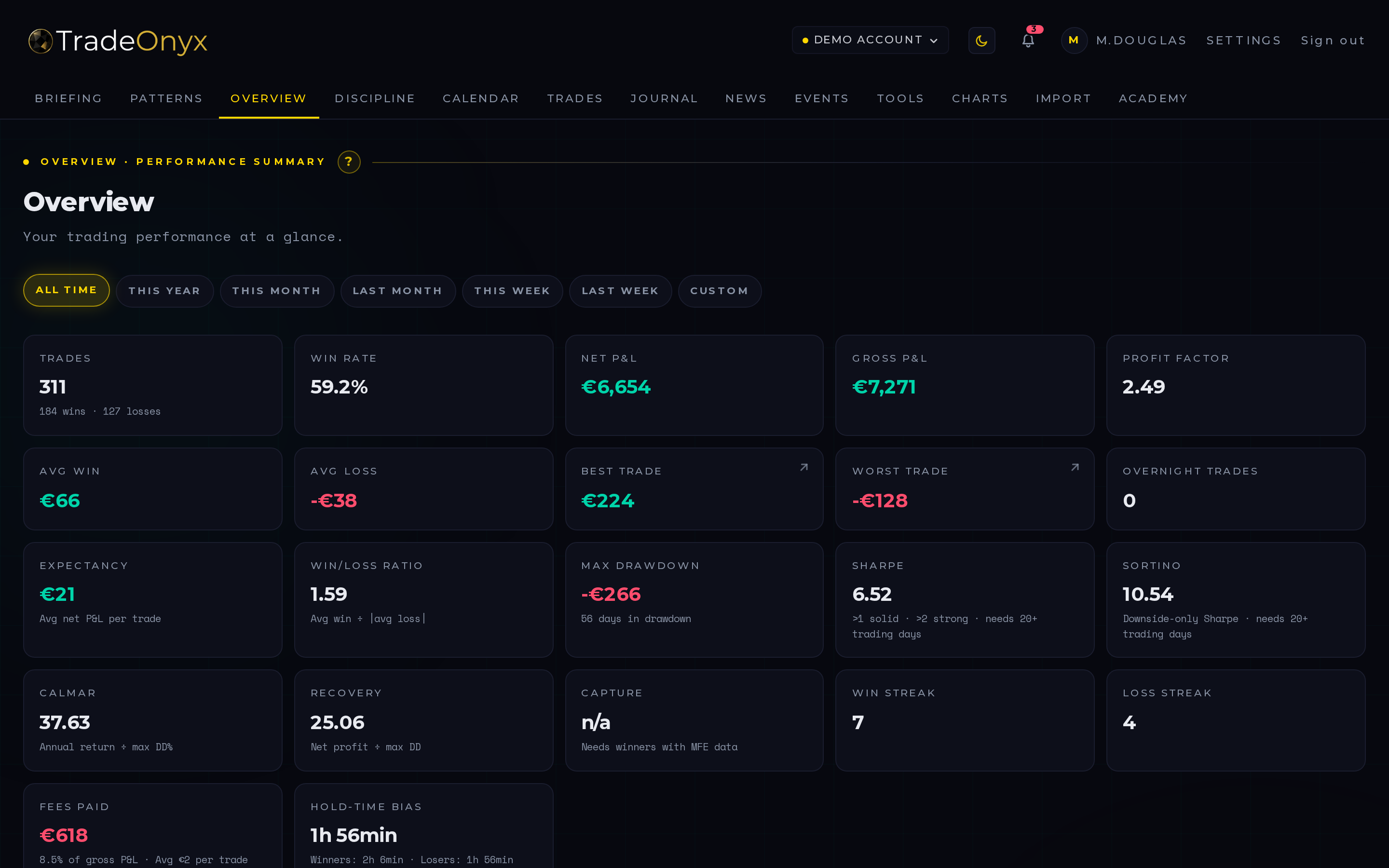
The Overview tab is the mission control of TradeOnyx. The top half plots your equity curve over the selected period. The bottom half shows your Win Rate, Profit Factor, Expectancy, Sharpe, Max Drawdown, Recovery Factor, Calmar — every metric that decides whether you have a real edge or a streak.
Two filters drive the whole view: Period (last week / last month / quarter / year / custom) and Account (which trading account you're studying). Switch period to compare regimes; switch account to spot which broker, strategy or portfolio is actually pulling its weight.
Under the KPI tiles sit two more views: a Monthly P&L bar chart (one bar per (year, month) you traded, green/red by sign) and a Weekday Performance chart that aggregates net P&L by the weekday you closed each trade — seven bars Monday through Sunday, the day where you consistently lose money pops out instantly. When the period is set to Year, an extra KPI tile appears: S&P 500 YTD with a delta line vs. your own YTD return — the "am I beating the market?" benchmark in one glance.
How to read the Overview at a glance: - Equity curve trending up but choppy — workable. Compare Sharpe across two periods to see if the chop is getting worse. - Equity curve flat or down despite many wins — win rate and profit factor disagree. Likely small wins, big losses → stop-loss discipline issue. - One period drastically better than another — regime change. Don't extrapolate the good period. Re-measure as the worse one matures. - Per-account split — one account's metrics dragging down the global average is a signal to study (or shut) that account. - Weekday chart shows one red bar much bigger than the others — that's a behavioural signal, not a market one. Most traders lose money on Mondays (no plan from the weekend) or Fridays (chasing P&L into the close). Find yours and stop trading it for a month — your aggregate edge often comes back without any other change. - S&P 500 YTD tile (year period only) — if your YTD trails the S&P, the honest question is whether the active management is paying its way. The delta colour signals it green/red without spin: green hint = you're outperforming, red hint = a passive ETF would have been a better year.
The Overview tab is the first stop after every closed trade. Not because every single trade matters — most don't — but because seeing your numbers update in real time prevents the slow drift away from reality. The trader who only checks at month-end is always six weeks behind their own edge.
In TradeOnyx the Overview computes everything from your actual trade history, including spread, slippage and commission baked into the fill prices on import. There's no "before fees" view because that view is fiction. The numbers you see are the numbers you live with.
The signature workflow: switch the period filter from 30 days to 90 days to 1 year. If your Sharpe and Profit Factor are stable across all three, the edge is real. If they spike on the short window and collapse on the long one, you've been lucky lately. Both are useful information — the platform just makes the comparison one click instead of three spreadsheet tabs.